
Geospatial Projects
Side Lot Sales Policy Eligibility Analysis
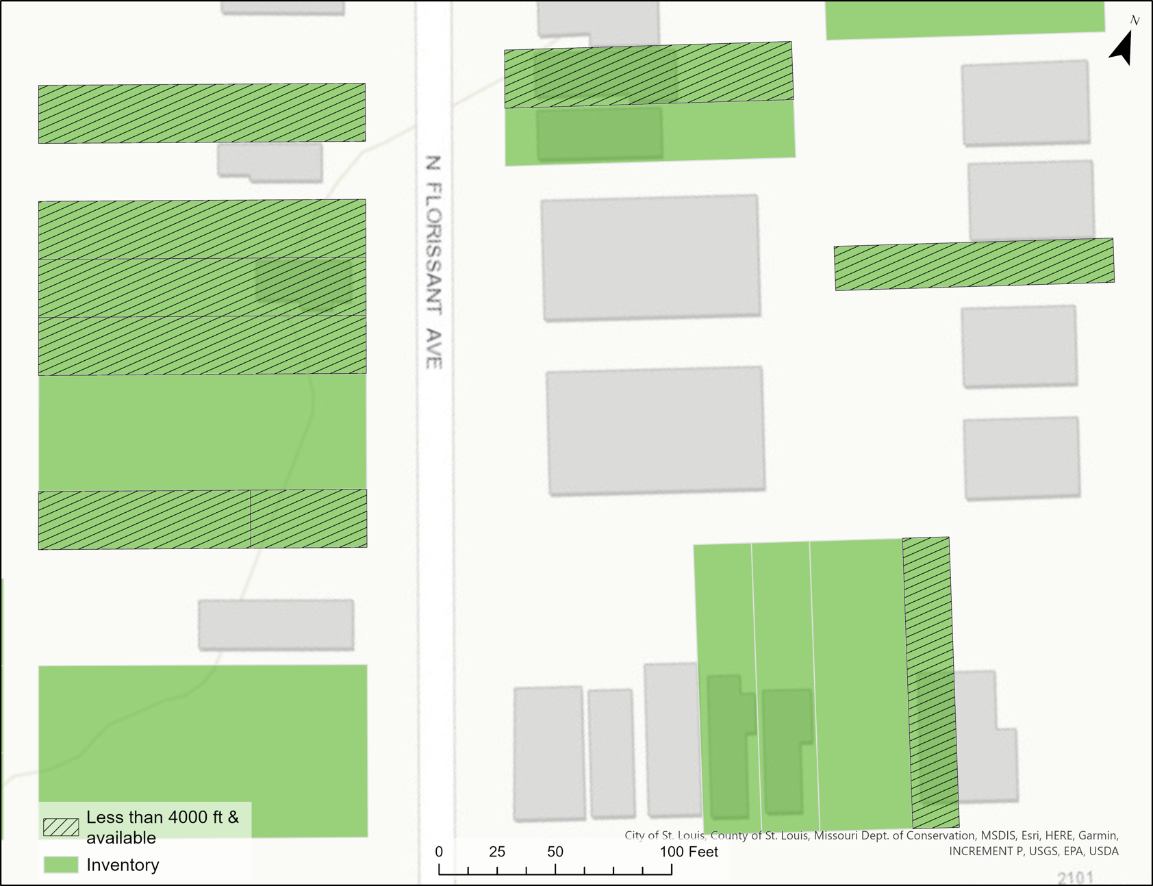
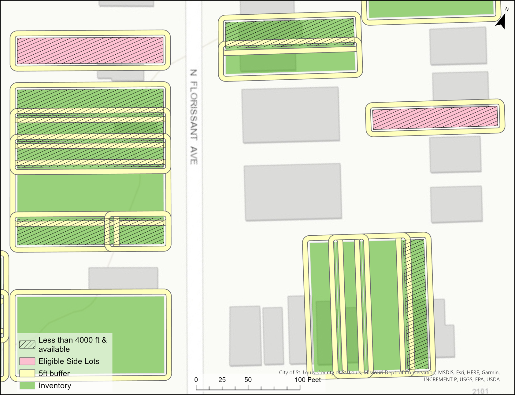
This analysis was to determine which parcels were eligible for the side lot sales policy based on 3 conditions. (1) The property has to be available within the database, (2) its area has to be < 4,000 sq feet and (3) not spatially contiguous to another property.
The below images identifies the first two conditions via the hatched symbol. To determine eligibility for contiguity, a buffer of a buffer was used to de-select parcels. See the below image (right).
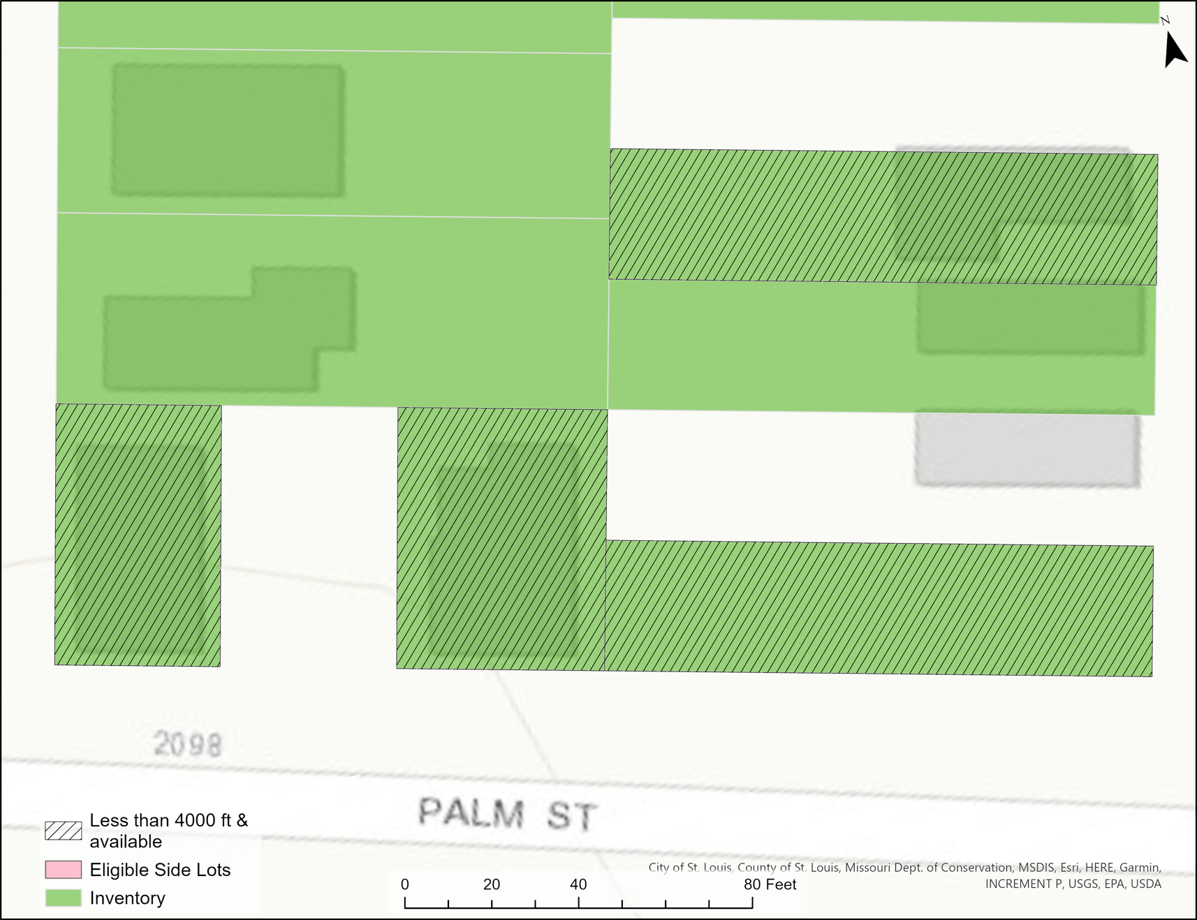
Because data is not always consistent, there are issues with this analyses where eligible side lots are not identified because of the ‘T’ shape (left) and diagonal parcels (right).
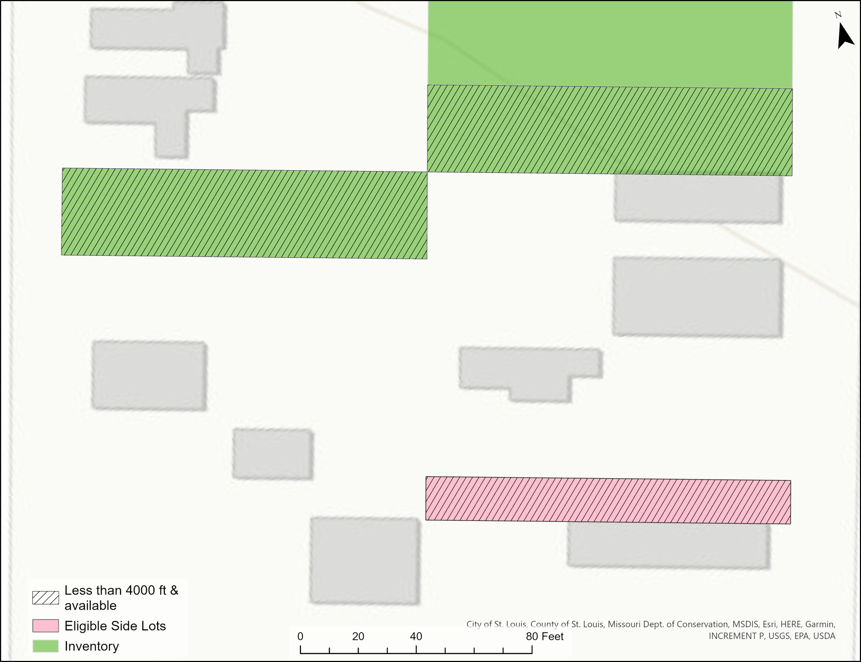
The workflow below would need to be modified to correct for these errors. 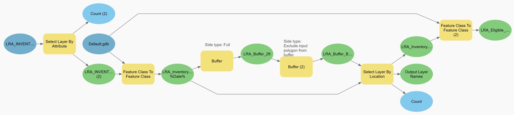
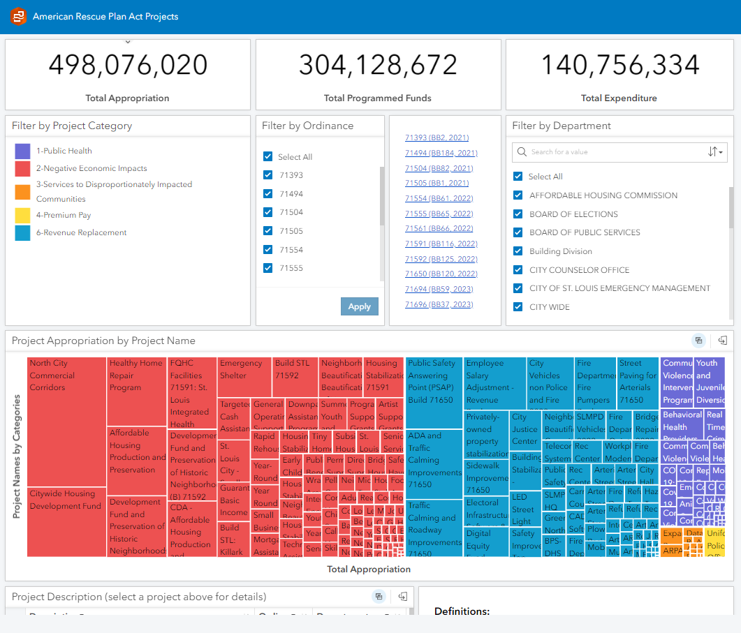
ARPA Transparency Portal Dashboard
This interactive dashboard was created through ArcGIS Insights. It serves as the transparency portal for appropriations, programmed funds and expenditures as it relates to the American Rescue Plan Act projects.
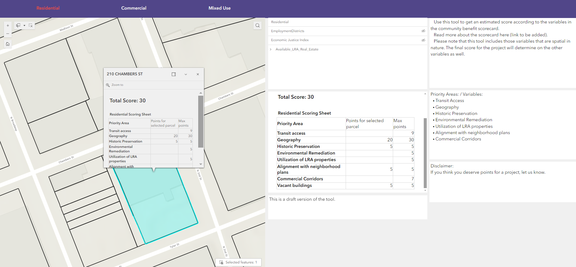
Community Benefits Scorecard Application
This Community Benefit Scorecard was created to inform the Economic Development Incentives team about how each potenial project scored against the pre-determined variables and depending on which category they fall under- Residential, Commercial or Mixed Use. It is a point based system for determining abatement terms and abatement level for each potential project that would be shared with developers. The variables considered while creating the score are transit access, whether or not it is a vacant building, its location etc. There is a maximum number of points available for each of these variables.
The data behind this scorecard was queried using SQL, and automated using Python and windows task scheduler.
In addition to these public facing applications, I also created internal facing dashboards and web applications.
GeoVisualization Examples
The below image shows 3 maps with the same theme (Global Fires), and different purposes to highlight the relationship between month-long fires (~70,000 records), landcover type and other variables. 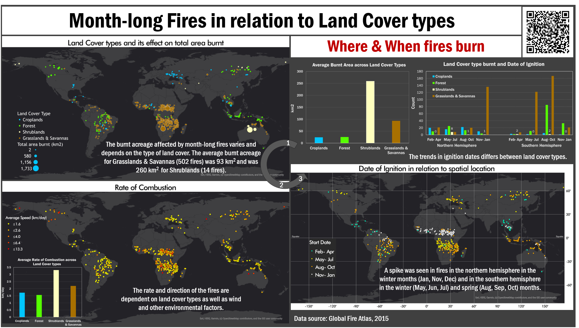
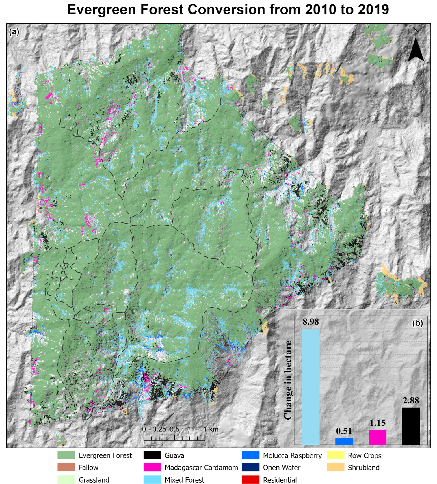
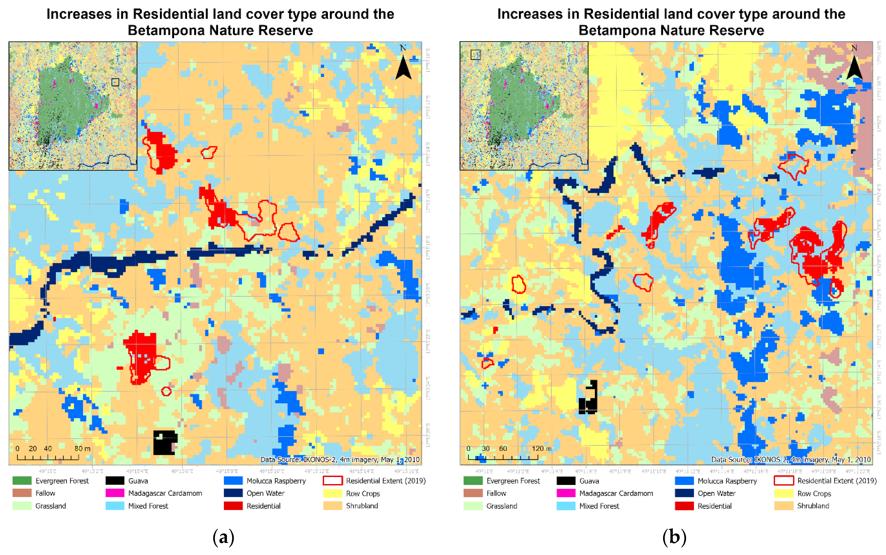
The below 2 images are based on my thesis, highlighting the change in land cover over time. Each image shows a unique way of presenting the changes in land cover. To read more about the research please visit the Remote Sensing page.
The below image compares NDVI values to Species Richness values broken down by year and highlighting the drought severity and coverage index (DSCI). This analysis and image was generated using python. 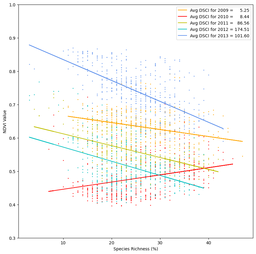
Surveys
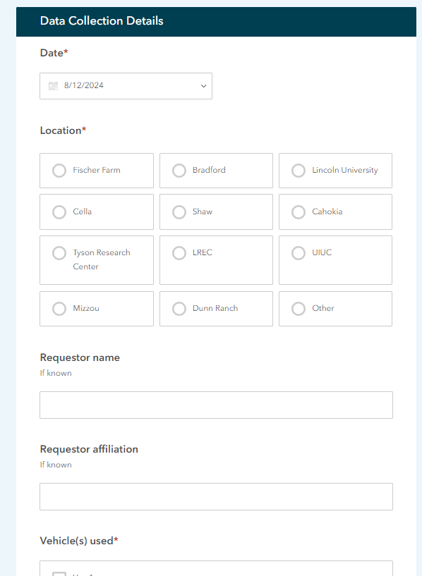
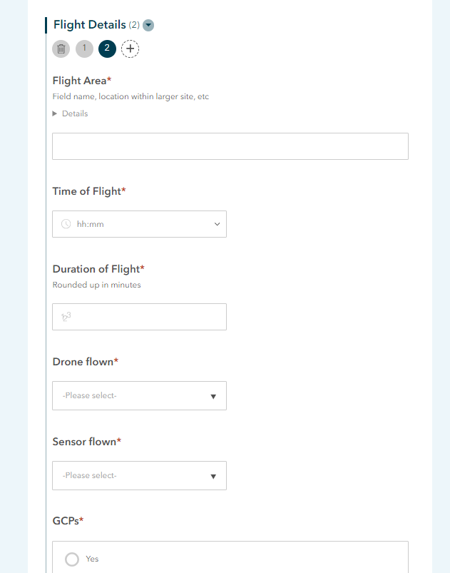
The below ‘Data Collection Survey’ was created using desktop interface for ArcGIS Survey123. It is able to create two tables having a one-to-many relationship between them based on the inputs from the survey.
*last updated in 2024